I’ve seen debates rage over the purity of images out of camera. “I want to get it right in the camera!” is the rally cry of the righteous. Yet they are missing a very important point.
In order to create really compelling images, you need all the data intact. All of it. You can’t risk blowing highlights and blocking shadows by asking the camera to hammer out the final product with all the saturation and contrast you desire for that “pop” that gives an image impact. You end up playing with razor thin margins for error and crossing the line all too often.
Once a highlight is blown or a shadow is blocked, there is no data left to process! So what do you do?
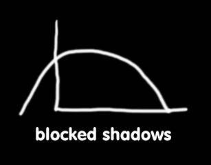
The answer, in my opinion, is to separate the concerns. The job at capture time is to fill the histogram with real data without losing any. No blown highlights and no blocked shadows. Let me illustrate with a few graphs:
Blocked shadows are obvious in any histogram. Everything bunches up to the left hand side and there is no space at all between the end of the histogram and the end of the data. Put another way, it does not cross x=0 at or below y=0. It crosses above. That’s bad. You can see images like this all the time, with blackness where there should be leaves in shadow. It’s pretty ugly in my opinion. The main cause is severe underexposure or very strong tone curves.
Blown highlights are the same on the right side of the histogram. Basically the data goes slamming into the end of the histogram and a bunch disappears. You see large white patches with no detail at all. Some cameras play tricks and fill in light grey, but that just makes for grey patches with no detail. 245,245,245 in a large section is actually uglier in my opinion than 255,255,255 … at least the latter is honest :-) The cause is the same as blocked shadows, although inverted … severe overexposure *of the highlights* … the rest might look fine. Harsh tone curves do a lot of damage.
 This is what we want to see. A histogram with all the data *inside* the curve. The image is a little flat-looking, but that’s ok. I always process my images, so I can apply curves to add more pop.
So let’s look at an image as an example. You will see what I mean, I am sure.
This is from that series I posted yesterday … some lovely garden shots form the F80EXR. My usual settings, which are designed to grab a great capture under most circumstances.
This image is not horrible, but I find it rather dull. The color is washed out, there is only a small but of the 3D look to the tulip itself and the background is a mess and totally distracting. All in all, a nice flower but a rotten picture.
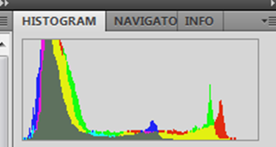
Its histogram, however, is pretty good.
There is no problem with the highlights, perhaps 1/3 stop underexposed (and I am fine with that) … note that the exposure was set at –1EV compensation, so as I have said before, don’t be afraid to chimp and set more negative compensation where you are getting problems. The yellow tulip makes up a small percentage of the frame, so I kept reducing exposure until the frame was more properly exposed, bringing the tulip in line as well.
I could have metered the tulip with spot metering and set +1ev compensation … that would have put the tulip at about the right part of the zone system. Works either way, the point is to check and adjust to make sure you get a great capture!
I took this image and performed rather a lot of processing on it. Of course, that’s only a few minites with my work flow. I used ACR6, then CS5. Some exposure and contrast work, some content-aware fill to fix the background. Some sharpening. Some local contrast. The usual.
This is what I cam up with.
Is that sufficient pop?
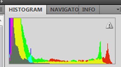
The histogram now shows more blocked shadows, which is perfectly acceptable because I chose that look.
And there you have it. One more thing … just to amuse you :-)

![DSCF2390_tulip_OOC[1] DSCF2390_tulip_OOC[1]](http://lh3.ggpht.com/_Rb8hA3-8sQQ/S-iY6WXBxaI/AAAAAAAAFtY/3YMbyIoIYvw/DSCF2390_tulip_OOC%5B1%5D%5B4%5D.jpg?imgmax=800)
![DSCF2390_tulip[1] DSCF2390_tulip[1]](http://lh3.ggpht.com/_Rb8hA3-8sQQ/S-iY768LGQI/AAAAAAAAFtk/DtZF3514gdE/DSCF2390_tulip%5B1%5D%5B4%5D.jpg?imgmax=800)
![DSCF2390_tulip_animated[1] DSCF2390_tulip_animated[1]](http://lh5.ggpht.com/_Rb8hA3-8sQQ/S-iY-LsgkTI/AAAAAAAAFt0/9WnrD5-gAMM/DSCF2390_tulip_animated%5B1%5D_thumb.gif?imgmax=800)
No comments:
Post a Comment